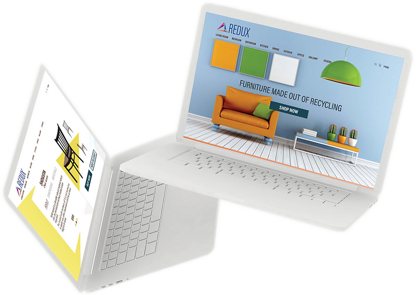
Creating a Brand:Redux
Creating a Brand:Redux

“Create a branding system that works efficiently across multiple touchpoints.”
Visual Interaction Design, California College of the Arts
ReDux is a service that offers products for the home that are made from recycled materials or upcycled materials. It keeps a variety of up-to-date styles and the latest trends in home products and furnishings.
DATE
7th October, 2019
DURATION
3 weeks
Brand Personality

A basic brand personality was developed by answering questions like “what does your brand hate”, “how would it greet someone” etc which helped me create its visual design later.
Brand Competition
Competitive Analysis and Matrix Diagram were used to analyze the competitors of Redux and where it would stand in comparison to them.
This shows that most of the brands go for a more formal and traditional outlook along with the use of a few subtle colors. This often results in them coming off as cold and distant. The navigation through these brands felt unclear and they seemed to have lacked a sense of uniformity across their screens making them seem unreliable.
Redux’s personality aims to be vibrant, colorful and friendly making users feel at home. It also has clear navigation and uniformity across screens and other touchpoints.
Competitive Analysis


Matrix Diagram

Moodboard
Many mood boards were created to convey the mood and style of Redux and finally, the one that fit the best with the brand was chosen.


Explorations

Final
Designing the Logo
The logo for Redux was developed by the process of exploration, iteration, and refinement.
A triangular shape was used to develop the final logo symbolizing the 3Rs (Reduce, Reuse, Recycle). With that, a colorful mosaic of smaller triangles was embedded in it.

Sketches


Computer
Color Combinations
Explorations

Final

Style Tile
Touchpoint 1: Mobile Application

A style tile was created to establish Redux’s personality. I went for a friendly yet clear and consistent visual language. Acumin Pro (Condensed) seemed the best typeface for the job.
Wireframes
Wireframes were created to ensure clear navigation and in deciding the structure of the different touchpoints(mobile application, website, bag and banner).

Bags and Banner


Website
Mobile
Final
The band personality of redux was applied across multiple touchpoints like mobile application, website, banner, and bag in a consistent manner.
Redux welcomes you with the “home screen” and through the various call to action buttons on it, the user is sent to the “items selection” screen where they find the furniture they are looking for with their detailed information in the “item detail” screen. Finally, the user is then directed to the “checkout summary” screen where they can buy the item(s).

Home screen
Items Selection
Checkout Summary
Item Detail
Menu


Touchpoint 2:Website
Homescreen

Items Selection
Item Detail
Checkout Summary
Home screen


Other Touchpoints


Banner
Bag
This project allowed me to create a consistent brand personality across several touchpoints. I struggled with the logo and figuring out a way to make one that went best with my brand, with that after brainstorming several ideas I was content with the one I chose. Finally, I’d like to conduct research, get a better understanding of my users and further iterate my product based on that.
Conclusion


